Truncated Design For Tech Apps
Dynamic text
Text on apps and web apps is mostly user generated. Users can type anything they want, which is why we are calling this text dynamic. Comments, tags, posts, user names, notes, addresses are all examples of dynamic text.
Comparing to the content you typed in your initial mock-up, text in real life can be longer, shorter or not present at all. If layouts are not elastic, they can break, resulting in a buggy and non-readable user interface.
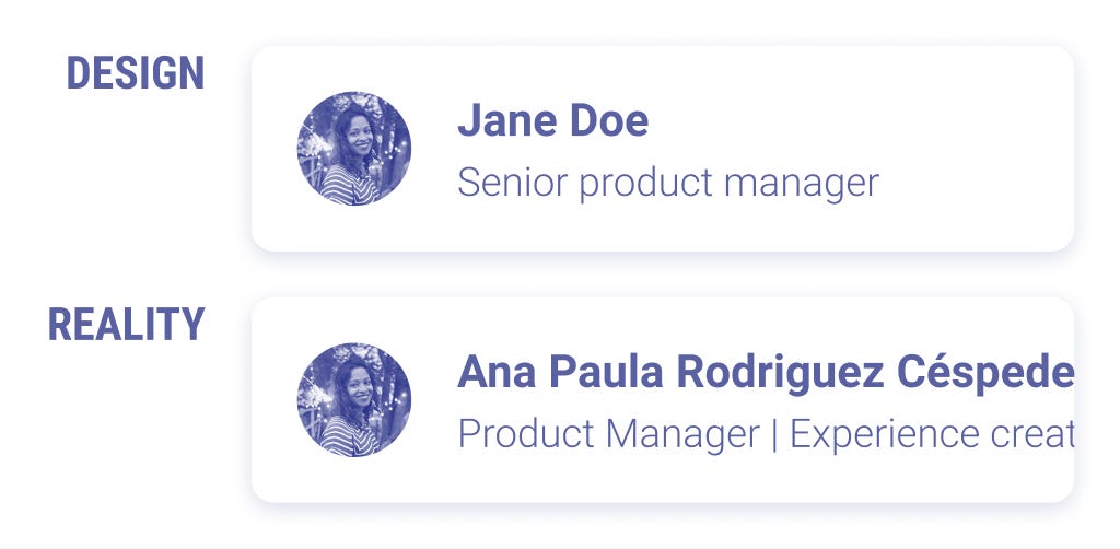
Localization (i.e. the process of adapting an existing website to another language and culture) requires fluid UIs, too. Apps that support multiple languages will likely have longer texts than the original English version.

When you work on a mockup, make sure you break it by typing content of different lengths. If the layout doesn't support texts that grow and shrink, here are some tips on how you can fix it.
Use truncation
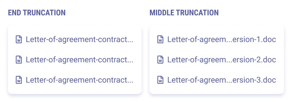
When text is too long to fit in the layout, you can shorten it and replace the missing part with ellipses. However, text truncation hides content that can be relevant to users. Always define the rules of truncation to avoid affecting the user experience. Decide if you want to trim the text at the end or in the middle and provide a way to read the full content using tooltips.
Make text wrap
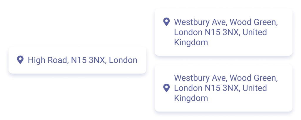
Unless you have space constraints, consider making the text wrap instead of truncation. Users will always be able to see the full content. If you're working on a complex layout, consider how the text should align with other elements when going on a second line. Top, bottom or middle?
Avoid small, fixed widths
Fixed widths don't allow text to expand. Make sure elements in your UI have room to grow.

Hide and show content
To contain the size of paragraphs, include a Read more button or some sort of expand and collapse behavior. This way, you can optimize the space in the page while supporting different length of text.
Images
During one of my first jobs, I was responsible for the design of a news blog dedicated to the 2015 World Expo. My idea was to craft a modern UI that would recall the bright and colorful exhibition brand. I used vivid colors and gave space to big, eye-catching pictures of organic and healthy food (the theme of that year's Expo). Both my client and my team loved the look and feel, so we went on and implemented what I designed.
Once our client started publishing content on the platform, the website was everything but eye-catching. I found out the articles were not related to the exhibition itself, but to the administrative work done by a committee. The few photos they posted were all about meetings and conferences. Also, because they were not tech-savvy, the size of the pictures was often all wrong and the quality very low.
If I had broken my design by prototyping with low quality, dull pictures, I would have realized that my design idea wasn't the right one.
Here's what you can do to avoid my mistake.
Know the content authors
If you want to rely on beautiful photography, make sure your users are somehow experienced in posting good quality pictures.
Make the UI multi-color-proof
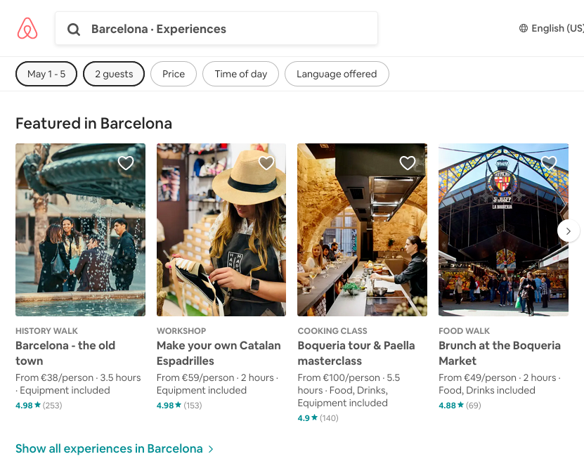
When photography is a strong visual element, the rest of the UI should be neutral. Your users might upload pictures of any colors or style. The interface should support those strong visuals, not clash with them.
Ensure text on pictures stays readable
Contrast should be strong enough both with dark and light images. Consider putting a layer or a gradient behind the text.
Bonus tip
If you want to display users' logo across your app, guide them when they upload it. Logos can be square-shaped, rectangular, very small or very large. Define a shape for the logo and make users crop it within these constraints. You'll be sure you can re-use it safely in any layout.
Screens and monitors
A few years ago, my then manager encouraged everybody in the design team to plug a low-resolution monitor into our 27-inches retina display iMac. The idea was to optimize our designs for the devices our users were more likely to use: non-top of the range desktop computers.
We discovered many visual issues that affected readability and user experience. Colors contrast was low and fonts were not crisp and readable enough.
Unless you're designing for iPhone or iPad, where all models are similar in screen size and resolution, consider users won't likely have a state-of-the-art monitor.
To make your design bullet-proof for devices optimization, always remember to:
Preview your artboards
Figma and Sketch offer a global overview of many long pages at the same time. But things feel different when you are within the constraints of a browser or device. Always test your designs in real scenarios. If you're working for mobile, mirror your screen on your phone at all times. On desktop, you can play your prototype in a browser using Figma or Sketch embedded features.
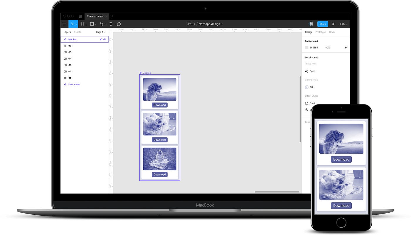
Downgrade your monitor
High definition screens are important for crafting UI elements with precision. But it can be very helpful to test them against low resolutions and poor color contrast. For example, you'll be able to spot when the background or the text becomes too light to be visible.
Don't forget 2 in 1 laptops
Touch screen laptops that can convert into large tablets are becoming very popular. Even if you're not designing for mobile, think it twice before hiding important actions behind a mouse-hover interaction. Users on touch screens will have a hard time discovering it.
Lists
The majority of apps contains lists or collections of items. That is, any piece of content that repeats, displaying variable data.
Lists are dynamic. Static mockups are not a great tool to explore those dynamic properties. You can follow these guidelines to prevent unexpected fallouts.
Plan for long lists
Designing a few items from your list is usually enough to see how this will look and work. However, it's easy to forget that lists can be much longer than what we designed. If not planned beforehand, this can affect the user experience. For example, what if we put a very important section just below a list that can grow for hundreds of items?
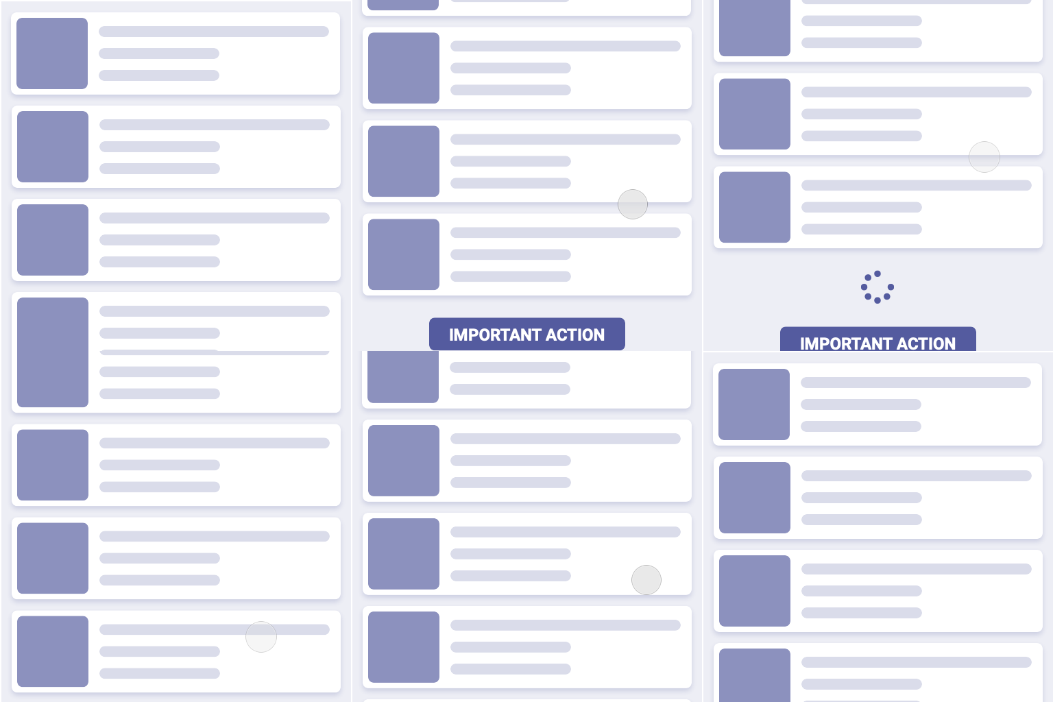
Be mindful of loading times
Lists need to download their data from a server. This won't necessarily happen in real-time. How long will it take to load the data to fully display your list? Is the loading state optimized for the loading time?
Remember to paginate
When lists are very long, they are usually paginated, i.e. loaded in small chunks called pages. Pagination make use of many patterns: the classic numbers at the bottom of the page, fetch on scroll or infinite loading. In all cases, be prepared to accommodate lists that change in their length, push items below and change the size of the page.
Truncated Design For Tech Apps
Source: https://uxplanet.org/break-it-until-you-make-it-24318cfd6392
Posted by: hollowayblighte76.blogspot.com

0 Response to "Truncated Design For Tech Apps"
Post a Comment